

Why is that a good (read useful) dashboard is about as common as a millennial on the housing ladder? Well, trouble is there’s no magic bullet for this, so I’ll try and distil what I think are some of the answers.
Context
Some interesting words in there. Controls is my favourite… If you get into any vehicle you are presented with one of these… Things like running out of juice or your engine overheating… they’re normally fairly easy to spot as they’re on a little dial and red generally means bad…What am I getting at? Dashboards in vehicles are blindingly EASY to use – you can tell within a matter of seconds of looking at the dashboard as to the likelihood of the car turning into a fiery tomb or running out of petrol on murder mile at 4 in the morning.
Often this idea of context seems to be lost when the dashboard is designed. The lazy dashboard merely takes a large data signal and presents it in a pretty(ish) graph or chart. What’s missing here is any element of control or god forbid – a target. “Oh look! that line went up, ooh that went down!.” Interesting? Maybe? Useful? Nope…
The fix? Add context, in layman’s terms make it bloody easy to understand... The very nature of a dashboard is that it is to be glanced at. You want your users coming away with a sit-rep in seconds, not scratching their heads as they try and fathom what it all means.
So, if your dashboard is a presenting metrics like email click through rates or Open Rates it needs either a comparative measure (STLY, industry benchmark etc…) or a target that you're aiming for or you’re just painting by numbers. What represents good? What represents bad/indifferent? Without context it’s just yet another report that your consumers don’t read and don’t want. You need to hammer them with the result – if your client’s CtRs are setting industry smashing records for their woefulness then make sure your dashboard communicates this as unsubtly as possible! On a side note, I’m a big fan of triggered alerts – if a metric goes above or below a threshold then boom, out goes an email to check the dashboard….
Years ago, I encountered a beautiful example where a marketing manager taking me through his campaign dashboard was terribly proud about the fact that his ROI had gone up. He was somewhat crest fallen when I remarked, “that’s very good, bit of a shame that you have missed your revenue target by a country mile” …. Taken in isolation that metric was utterly pointless as there was no context whatsoever. Subplot here is that marketers are criminally awful at communicating bad news and will try and skirt the real issue as much as possible with creative use of statistics…
“The Marketing Dashboard” - new cartoon and post on how “not everything that counts can be counted, and not everything that can be counted counts” https://t.co/Aq8BUBcXXh#marketing #data #dashboard #cartoon pic.twitter.com/AwaPTpKIYP
— Tom Fishburne (@tomfishburne) November 4, 2018
Design/Content
The ROI incident mentioned above brings me to another point. The complexity – in the above example you have the creator of the dashboard throwing around metrics that he barely understands himself, imagine his poor readers, if he has any.
This post is not meant to be a deep dive into UX but as a creator of dashboards you need to create for your audience, both in terms of the way you present data and what you present or you’ll find yourself into what is commonly known as the vicious spiral of dashboard death (TM me) where the creator of the dashboard becomes progressively more bummed that no-one is using his dashboards, due to the fact that the intended recipients don’t know how to use it and are too embarrassed to ask. This then becomes an infinite loop of nothingness that can last for decades.
For years I worked under an MD that was obsessively data focussed. And by data I mean just data, he was quite happy with pivoted outputs, ranked league tables, as many commentaries or visualisations that I produced he wouldn’t care – only the data was important. Why am I telling you this? It’s about getting the medium right for the users – if your users are ‘not analytical’ they may need commentary or visualisations to “get” your dashboards. Similarly, if you’re are dealing with users that are inexperienced or not familiar with the metrics in your dash be explicit to the point of blunt, nobody wants to be the n00b that gets sniggered at for not knowing what VtR or CTOR means when the terms are getting tossed around in meetings eh?
The (F)law of averages.
Did you hear the one about the statistician that drowned crossing a river? He calculated the average depth was 3ft…. badum tssh.. (Apologies to Harvard Business Review)
I’ve seen this in effect, normally by overzealous young jedis that have compared averages without looking at the data underneath.
To illustrate, here’s 2 made up data sets. It could be clickthrough rate of 2 creatives over time, that’s not the important bit.
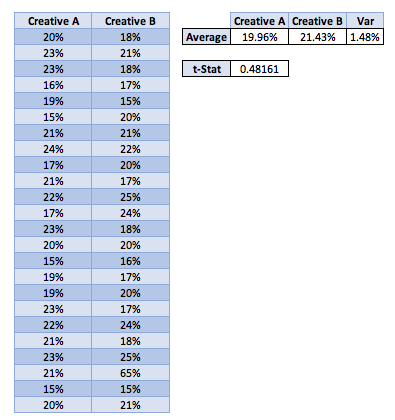
The problem here is that your trusty dashboard will report a nice little uptick in the CtR – average went up by nearly 1.5% percentage points, which if you’re working with large numbers is quite a handsome amount.
However, look at the data beneath that and its not quite so rosy. There’s one whacking great outlier in there that is horribly skewing the data making campaign B look vastly more sexy than it really is.
Disclaimer – mathy bit coming: For anyone that attended more than 2 compulsory stats lectures you might remember back to the trusty student’s t-test – that compares the averages of 2 data sets and tells you if they really are different by way of the t-stat.. If the t-stat is less than 0.05, fair enough they really are different, if its greater then sadly nope you can’t claim that campaign B is the new daddy… In this case… ouch…
“What’s that? you’ve updated all your creatives following the ‘excellent results’ of campaign B without a thorough investigation of the underlying data sets???????”
“Oh dear, tell me where you’re having your leaving drinks.”
There endeth my stream of subconsciousness... In conclusion. Crap dashboards = easy. Good dashboards = hard…But, add context + simplicity and season with a generous helping of proper maths and you’ll will be better than 42.64741% of other creators.