

Whoever named them cookies clearly knew how branding worked. I find it very hard to press 'reject cookies' when there's the possibility some shortbread might be taken away from me. Mmm...shortbread.
But with the advent of the EU General Data Protection Regulation (or for the cool kids: GDPR), it's been your right to turn down that Fig Roll. If you're on like Keto or whatever.
While the intent of most cookie banners are the same, i.e. to get a user's consent to keep collecting and analysing their data and behaviour on the site, the execution can differ wildly.
41% of marketers say digital media activation will be the area most impacted by the rise of privacy-related data restriction. This comes ahead of web analytics, digital media measurement, and direct marketing activation. So, making sure you do data collection right, fairly, and on-brand is important.
It's also important to keep in mind that a cookie policy isn't just required for us bike-riding, mountain-hiking, weaver's-cottages-owning, pastry-making people in Europe. It's also necessary for any website getting traffic from users from an EU member state.
So let's do a quick run-down of what a cookie is, before you give people the chance to block 'em.
What is a Cookie?
Cookies are itty-bitty text files that are downloaded onto your visitor's device, be it a laptop or a phone, when they click onto your site. These files basically track and analyse your user's behaviour, and recognise their device, in order to store details about their preferences.
Cookies can:
- Save user login details
- Target personalised and relevant ads to your user
- Measure how often an individual visits your websites, and what they do when they're there.
A majority of people willingly provide consent without using the cookie notice at all. This may be because they are familiar with the notices on other sites, or that they expect the website wouldn't be usable, or content be accessible otherwise. Another possibility is that they find the banner annoying, and want a full view of whatever dog's Instagram they've clicked on.
People are also aware that cookies allow for site optimisation, in the form of personalisation. And people love personalisation. In fact, 74% of marketers say targeted personalisation increases customer engagement, with a 20% increase in sales when using personalised experiences.
So, keeping the banner simple (it's just going to be dismissed), informative (so the user knows what's what), and eye-catching (so it's just a little bit annoying, and isn't missed), makes for a winning combination.
What should a cookie consent banner say?
There's a few things a cookie banner should include, in order to be informative and accessible. So, it should contain a:
Consent message. This means including text that informs users that the website stores cookies, and how those cookies are used.
Consent options. These are a couple of big ol' buttons giving user's the options to opt in or out. Plus an extra to manage cookie settings, for those who have the time.
Cookie policy. This means including a link to your cookie policy, that describes your site's use of cookies, their categories, and how the visitor can manage cookies.
Okay, now onto the examples, what they do, and how they do it well. A triple threat. You're welcome.
1. Burger King: eye-catching design
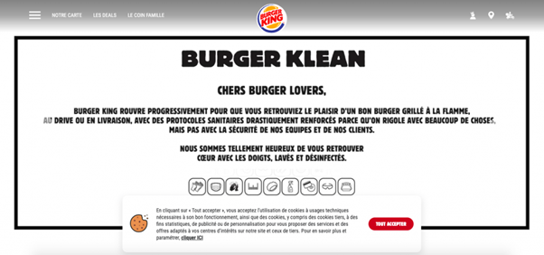
First up, the burger monarch himself. I didn't even know Burger King sold cookies, am I right? Heh heh. Heh. Oh, tough crowd.
The banner is deliberately narrower, in order to stand out on the page. Plus, the big red button is sitting there, waiting to be clicked. Statistics and advertising cookies are disabled by default, so the brand really wants the user to click on "accept all".
Incorporating an eye-catching, simple design including the button and the little cookie graphic makes the banner interactive and engaging, without being annoying or tedious.
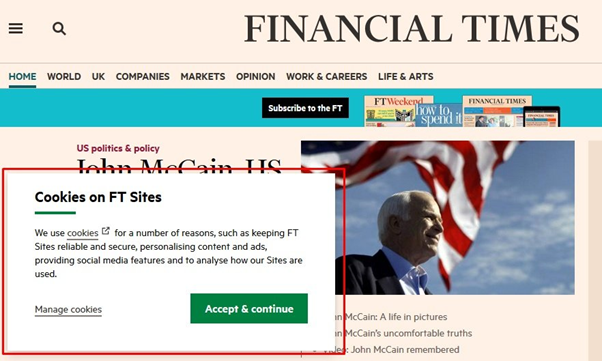
2. Financial Times: corner box
I bet you're reading this left to right, just like eeeeeeveryone else. What you don't know is that if you read this entire article right to left, you'll actually get a completely different article about cookies. Albeit one that makes no sense, but still.
Some companies, like the Financial Times, have been including a pop-up box in the corner of their website to highlight their cookie policy. This is where the eyes naturally go, so instead of being eye-catching, they're working with the eyes, meaning they seem less intrusive but not less prominent.
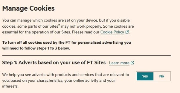
The text in this example also clearly indicates which cookies are being used to keep the site usable and secure, and which are for the purposes of advertising and personalisation. The FT also provides a link to its cookies policy, and an option for users to manage their cookies:
To see what else the FT is getting right, come see Gregor Young speak on all things data, at this year's #MarTechFest Global! Click here to book tickets! Imagine being in the same room as the guy whose company used the pop-up cookie banner. I'd personally be star struck.
3. Backmarket: on brand
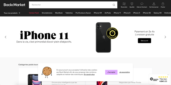
It's important to stay on-brand with your cookie banner. If your brand is funny, be funny. If your brand is design-based and visual, be visually appealing.
This reduces the annoyance of the banner, plus it increases engagement. If the user is on your site, the likelihood is that they want to interact with your brand, and your brand's message, so this may increase their chance of reading and clicking on your 'manage cookies' message.
This has been done well by Backmarket who, instead of just chucking up a banner, have included a nice little animated gif of a cookie. The banner keeps everything very clean, very visual, and very on brand.
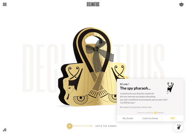
Declamatuus does this well, too. Using a mascot helps keep the banner light and conversational, with engaging copy meaning the user is more likely to read the message, and remember it.
4. Decathlon Assurances: pop up
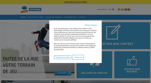
Now, it is universally accepted that pop ups are annoying. But by god, are they effective.
Using pop ups ensures that you're giving users the option to reject cookies, as well as accept them. There's no ignoring that little banner at the peripherals of the screen, oh no.
Although, keep this in mind: cookie walls are banned under EU cookie laws, as they force users to accept cookies to access a website, thus leaving users with no free choice. So keep that balance.
Decathlon makes that reject option clear, as well as the option to read more.
5. Coventry University: simplicity
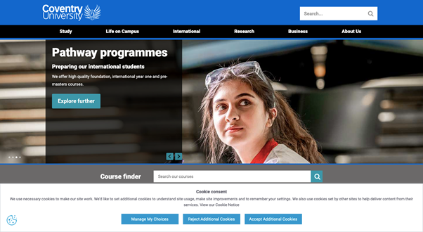
Now, these are all inventive and impactful examples. But something that never goes out of style is something simple, classic, clean. No, not a beige trench coat. No, not a Bentley. It's this banner from Coventry University.
Cov Uni uses a footer banner that links to their cookie settings, where users can manage the cookies that they want the site to use. It uses clear wording in the cookie consent message to inform users about necessary cookies that are set by default.
The three buttons are the same size, the request isn't leading, and the message is clear. It also follows the three key cookie banner components mentioned previously. No need for pizzazz.
There's no point messing around with this stuff too much. Yes, it's important to remain brand consistent, but The ICO has just handed out two fines for £99m and £183m.
Those are stand-up-and-take-notice figures which show they’re prepared to enforce GDPR seriously. Their head of technology policy just said “Cookie compliance will be an increasing regulatory priority for the ICO in the future”.
So, sometimes simplicity and clarity is key.
Want to hear more about data, martech, pugs and beyond? Join us at this year's #MarTechFest Global! Click 👉here👈 to buy your ticket!